BABAEREN LOGO DESIGN
- Client
- Babaeren
- Year
- 2026
- Tools Used
- Adobe Illustrator, Adobe Photoshop
- Category
- Logo Design
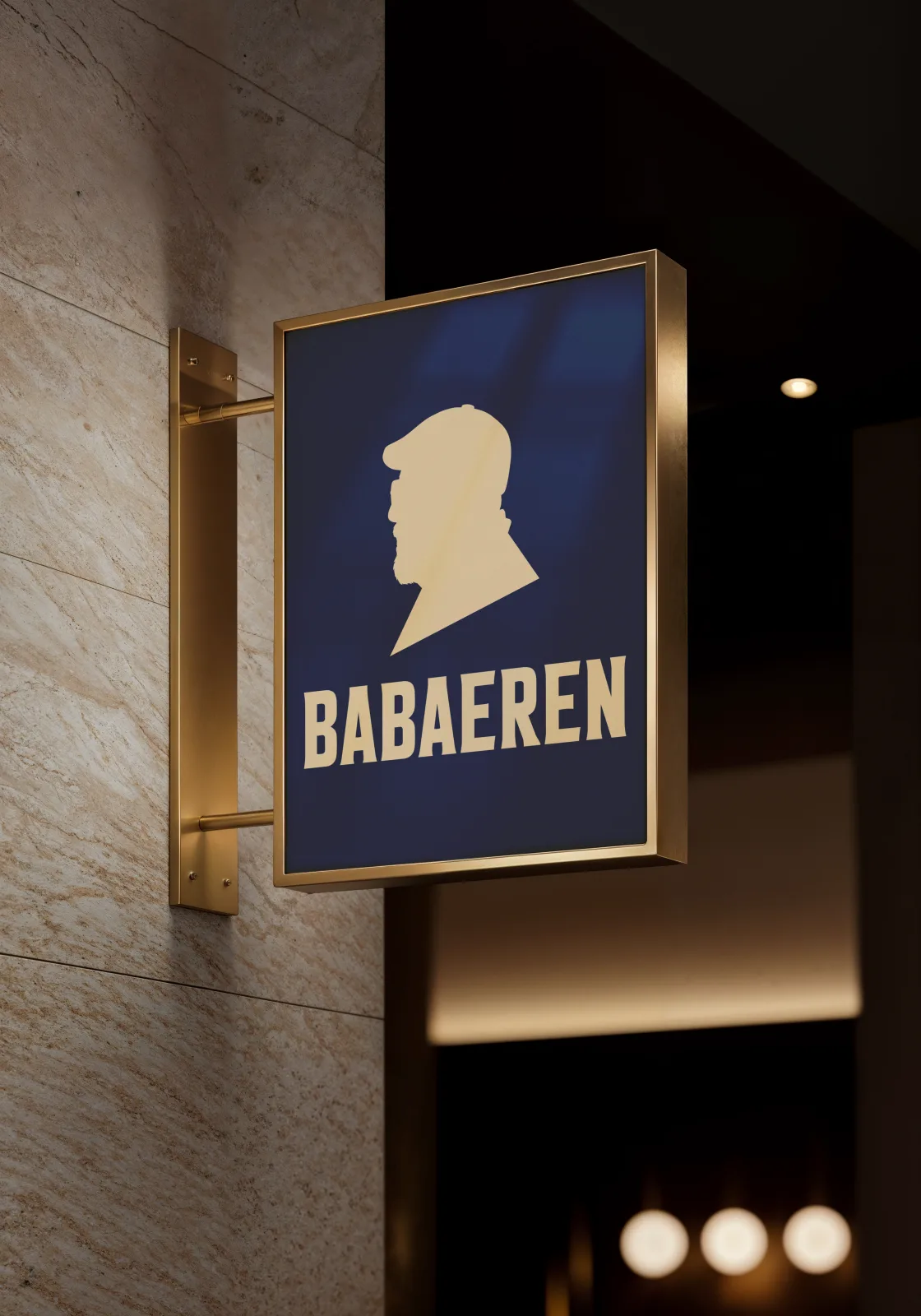
For BABAEREN, active in the food sector since 1972 and looking to open a new chapter with a retail coffee and café concept, I carried out a comprehensive logo and brand-identity project.
Giving a visual identity to a coffee brand built on more than half a century of food tradition made the project both exciting and delicate. The client had a clear stance: a brand with character, distant from foreign names, 'gentleman' clichés and the sector's repetitive visual patterns, wanting to tell its own story in its own voice. That conviction became my greatest source of inspiration.
I began with in-depth sector research and competitor analysis. I studied the visual language of national coffee brands and mapped what repeats and what is missing. Beyond the typical coffee-bean silhouettes, cup-steam icons and brown tones, I was looking for a narrative, a form that would unite the brand's 50+ years of experience and the warmth carried by the concept of 'father' in a single mark.
In the sketch process I tried dozens of directions: negative-space studies where the father figure merges with a cup, abstract approaches uniting a coffee pot with a moustache form, profile silhouettes and character illustrations. Each alternative told a different story, but what I sought was very specific: a silhouette at first glance, a heritage at second.
The resulting logomark distils all the emotion the name 'Baba Eren' carries into a single form. The profile silhouette of the flat-capped father figure creates a timeless character, as modern as it is traditional. The simplicity of the silhouette is a deliberate choice: to focus not on facial features but on stance. Because BABAEREN is not a face but an attitude, the stance of a man who never lets the cup leave his hand, who tells a memory with every sip, who brews coffee not just to drink but to live.
The colour palette was built as the quiet supporter of this story. Deep navy carries corporate authority and the night atmosphere of premium coffee houses, while the gold tone symbolises value and mastery passed down through generations. Together these two colours both reassure and invite, just like a father's offer of coffee.
Beyond the logo, I prepared a character pack that brings the father figure to life in different moods and atmospheres, in-venue application examples, a sticker set and a comprehensive brand presentation. The aim was not just to deliver a logo, but to build a holistic brand language that whispers the same story at every touchpoint of BABAEREN.
Project Gallery
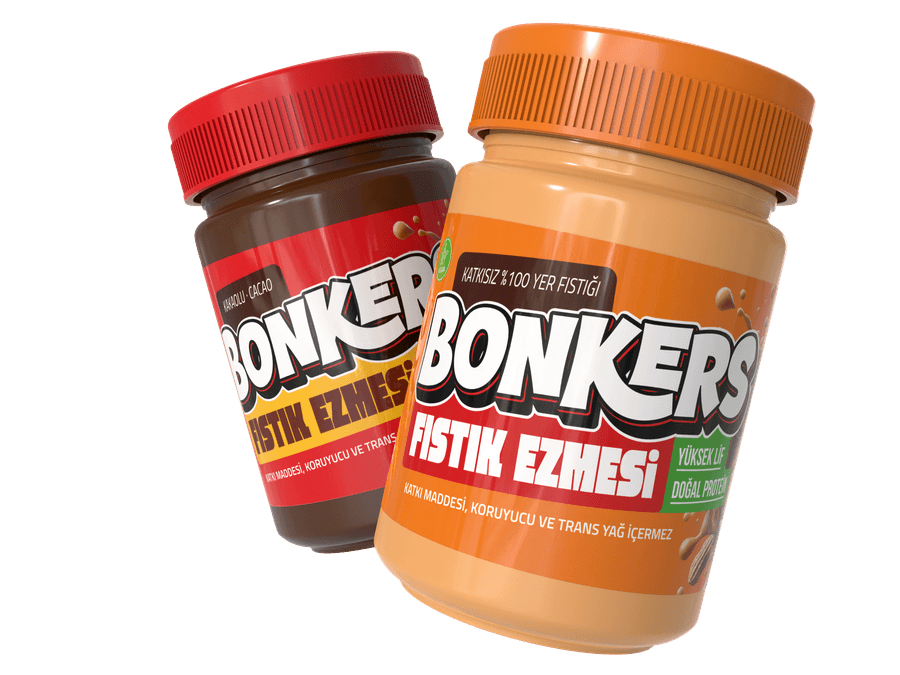
Packaging designs where I consider every detail
I create print-ready packaging that makes your product stand out on the shelf.
Learn More- Satisfaction guarantee
- 100% original design
- Print-ready PDF